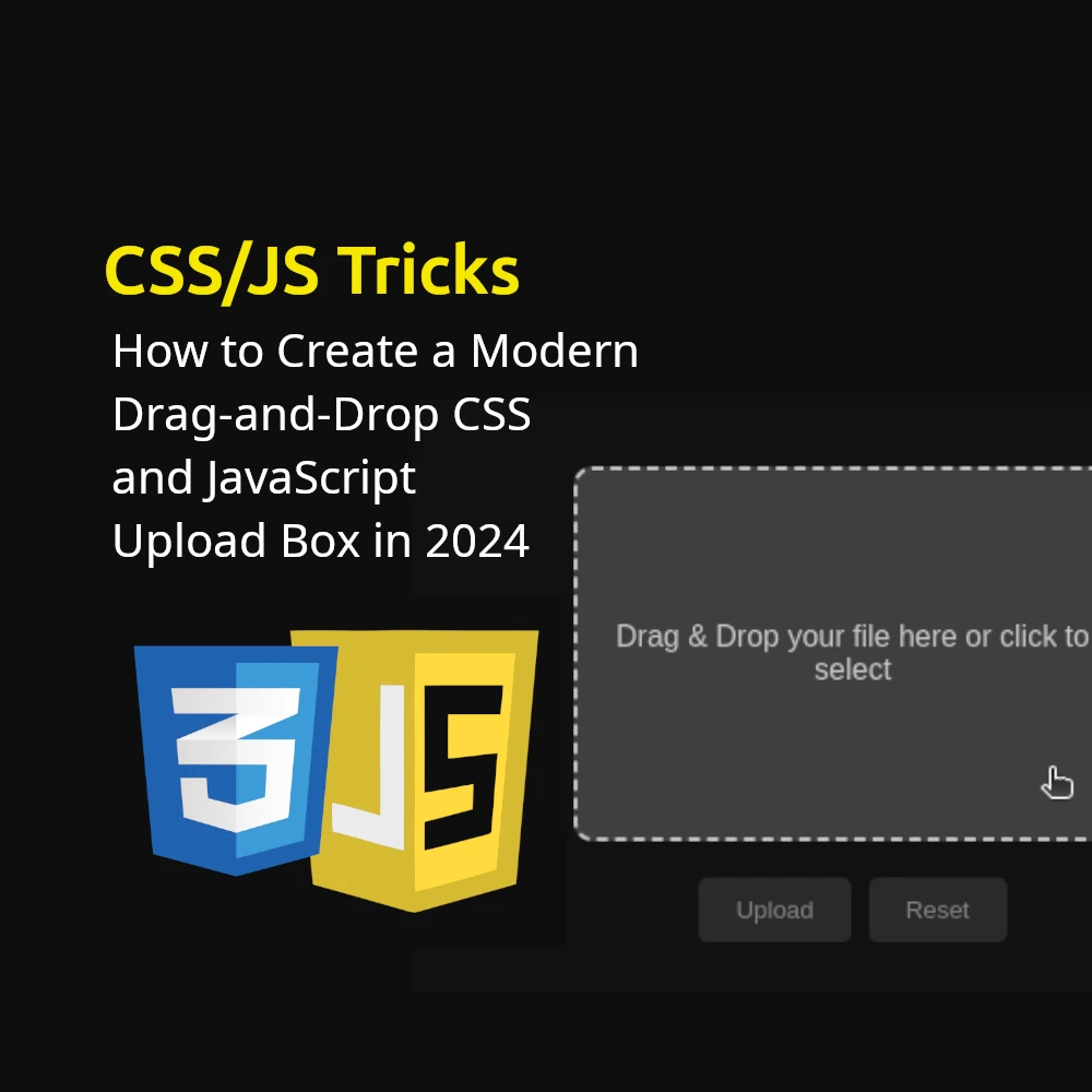
Enhancing user experience on your website often begins with intuitive design elements like a modern upload box. In this tutorial, we’ll guide you through building a sleek, dark-themed upload box complete with drag-and-drop and click-to-select functionalities. This stylish interface includes a popup notification upon successful file uploads. Let’s dive in!
Introduction
Today, we’ll craft a user-friendly upload box that supports both drag-and-drop and file selection from your device. This design features a contemporary dark theme with a glassy background and a reassuring success popup.
HTML Structure
Let’s start by setting up the foundational HTML structure, divided into key sections for clarity.
HTML: The Container and Upload Box
<!DOCTYPE html>
<html lang="en">
<head>
    <meta charset="UTF-8">
    <meta name="viewport" content="width=device-width, initial-scale=1.0">
    <title>Dark Upload Box</title>
    <link rel="stylesheet" href="styles.css">
    <link rel="stylesheet" href="https://cdnjs.cloudflare.com/ajax/libs/font-awesome/6.0.0-beta3/css/all.min.css">
</head>
<body>
    <div class="upload-container">
        <div class="upload-box" id="upload-box">
            <p id="upload-text">Drag & Drop your file here or click to select</p>
            <input type="file" id="file-input" style="display: none;">
        </div>
    </div>
    <div class="buttons">
        <button id="upload-btn" disabled>Upload</button>
        <button id="reset-btn" disabled>Reset</button>
    </div>
    <div class="popup" id="popup">
        <div class="popup-content">
            <i class="fas fa-check-circle fa-3x success-icon"></i>
            <p>Upload Successful!</p>
            <button id="close-popup-btn">Close</button>
        </div>
    </div>
    <script src="script.js"></script>
</body>
</html>
Head Section: Contains meta tags for character set and viewport settings, a title for the document, and links to external CSS and Font Awesome for icons.
Upload Container: A container div that holds the upload box and buttons.
Upload Box: A div with an ID upload-box that contains a paragraph element for instructions and a hidden file input for click-to-select functionality.
CSS Styling
Now, let’s style our upload box and other elements to give it a modern, dark theme. We’ll break it into parts for better understanding.
CSS: Body and Container
body {
    display: flex;
    justify-content: center;
    align-items: center;
    height: 100vh;
    background-color: #121212;
    margin: 0;
    font-family: Arial, sans-serif;
}

.upload-container {
    display: flex;
    flex-direction: column;
    align-items: center;
}
Body: Sets up a flexbox layout to center content both vertically and horizontally, with a dark background color and no margin.
Upload Container: A flexbox container that centers its children and arranges them in a column.
CSS: Upload Box
.upload-box {
    width: 300px;
    height: 200px;
    background: rgba(255, 255, 255, 0.1);
    border: 2px dashed rgba(255, 255, 255, 0.5);
    border-radius: 10px;
    display: flex;
    justify-content: center;
    align-items: center;
    color: rgba(255, 255, 255, 0.7);
    text-align: center;
    transition: background 0.3s, border 0.3s;
    backdrop-filter: blur(10px);
    -webkit-backdrop-filter: blur(10px);
    margin-bottom: 20px;
    cursor: pointer;
}

.upload-box:hover {
    background: rgba(255, 255, 255, 0.2);
    border: 2px dashed rgba(255, 255, 255, 0.7);
}

.upload-box.dragover {
    background: rgba(255, 255, 255, 0.3);
    border: 2px dashed rgba(255, 255, 255, 0.9);
}

#upload-text {
    pointer-events: none;
}
Upload Box: Styles the upload box with a semi-transparent background, dashed border, rounded corners, centered content, and a blur effect. It also includes hover and dragover states for visual feedback.
Upload Text: Prevents pointer events on the text inside the upload box.
CSS: Buttons
.buttons {
    display: flex;
    gap: 10px;
}

button {
    padding: 10px 20px;
    border: none;
    border-radius: 5px;
    cursor: pointer;
    background: rgba(255, 255, 255, 0.1);
    color: rgba(255, 255, 255, 0.7);
    transition: background 0.3s, color 0.3s;
}

button:disabled {
    cursor: not-allowed;
    background: rgba(255, 255, 255, 0.1);
    color: rgba(255, 255, 255, 0.4);
}

button:hover:not(:disabled) {
    background: rgba(255, 255, 255, 0.2);
    color: rgba(255, 255, 255, 0.9);
}
Buttons Container: Arranges the buttons in a row with some spacing between them.
Button Styles: Styles the buttons with padding, rounded corners, a semi-transparent background, and smooth transitions. Disabled buttons have a different style, and enabled buttons change color on hover.
CSS: Popup
.popup {
    display: none;
    position: fixed;
    top: 0;
    left: 0;
    width: 100%;
    height: 100%;
    background: rgba(0, 0, 0, 0.5);
    justify-content: center;
    align-items: center;
}

.popup-content {
    background: rgba(255, 255, 255, 0.1);
    border-radius: 10px;
    padding: 20px;
    text-align: center;
    color: rgba(255, 255, 255, 0.7);
    backdrop-filter: blur(10px);
    -webkit-backdrop-filter: blur(10px);
}

.success-icon {
    color: #28a745;
    margin-bottom: 10px;
}

#close-popup-btn {
    margin-top: 10px;
    padding: 10px 20px;
    border: none;
    border-radius: 5px;
    cursor: pointer;
    background: rgba(255, 255, 255, 0.1);
    color: rgba(255, 255, 255, 0.7);
    transition: background 0.3s, color 0.3s;
}

#close-popup-btn:hover {
    background: rgba(255, 255, 255, 0.2);
    color: rgba(255, 255, 255, 0.9);
}
Popup: Styles the popup with a semi-transparent dark background that covers the entire viewport, centering its content.
Popup Content: Styles the content inside the popup with a blurred, semi-transparent background, rounded corners, and centered text.
Success Icon: Styles the Font Awesome check icon with a green color.
Close Button: Styles the close button similarly to the other buttons, with hover effects.
JavaScript Functionality
Finally, let’s add the JavaScript functionality to handle drag-and-drop, file selection, and displaying the success popup. We’ll break it into parts for better understanding.
JavaScript: DOMContentLoaded and Drag-and-Drop
document.addEventListener('DOMContentLoaded', () => {
    const uploadBox = document.getElementById('upload-box');
    const uploadText = document.getElementById('upload-text');
    const fileInput = document.getElementById('file-input');
    const uploadBtn = document.getElementById('upload-btn');
    const resetBtn = document.getElementById('reset-btn');
    const popup = document.getElementById('popup');
    const closePopupBtn = document.getElementById('close-popup-btn');

    uploadBox.addEventListener('dragover', (e) => {
        e.preventDefault();
        uploadBox.classList.add('dragover');
    });

    uploadBox.addEventListener('dragleave', () => {
        uploadBox.classList.remove('dragover');
    });

    uploadBox.addEventListener('drop', (e) => {
        e.preventDefault();
        uploadBox.classList.remove('dragover');
        const file = e.dataTransfer.files[0];
        handleFile(file);
    });

    fileInput.addEventListener('change', () => {
        const file = fileInput.files[0];
        handleFile(file);
    });
});
DOMContentLoaded Event: Ensures all DOM elements are loaded before executing JavaScript code.
Drag-and-Drop Events: Adds event listeners for dragover, dragleave, and drop events on the upload box to handle file drag-and-drop operations.
File Input Change Event: Adds an event listener for file input changes to handle file selection via click.
JavaScript: File Input and Button Handlers
function handleFile(file) {
    if (file) {
        const reader = new FileReader();
        reader.onload = function(e) {
            // Display file name or handle file contents as needed
            console.log(`Uploaded file: ${file.name}`);
            showPopup();
        };
        reader.readAsDataURL(file);
    }
}

function showPopup() {
    popup.style.display = 'flex';
}

closePopupBtn.addEventListener('click', () => {
    popup.style.display = 'none';
});
File Reader: Reads the contents of the uploaded file (in this case, logs the file name to the console and could be expanded to handle file content display).
Show Popup Function: Displays the success popup by setting its style to flex.
Close Popup Button Event: Adds an event listener to the close button inside the popup to hide the popup when clicked.
Conclusion
Congratulations! You’ve successfully created a stylish dark-themed upload box with drag-and-drop and click-to-select file upload capabilities. By combining CSS for design and JavaScript for functionality, you’ve enhanced user interaction and provided visual feedback with a success popup. Experiment with further customization and explore additional features to suit your application’s needs.
