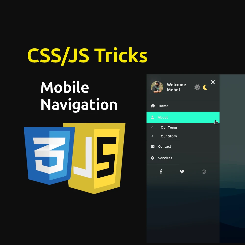
In today’s digital landscape, where user experience reigns supreme, crafting an intuitive and visually appealing mobile navigation menu is crucial. Let’s delve into the design and implementation of a robust CSS and JS mobile navigation menu that not only enhances functionality but also elevates user satisfaction.
Why a Mobile Navigation Menu Matters
Mobile devices have become the predominant platform for accessing the internet. Therefore, optimizing navigation for smaller screens is imperative. A well-designed mobile navigation menu ensures that users can effortlessly navigate through your website, leading to increased engagement and reduced bounce rates.
Table of Contents
Crafting the Perfect Mobile Navigation Menu: Enhance User Experience with CSS and JS
In today’s digital landscape, where user experience reigns supreme, crafting an intuitive and visually appealing mobile navigation menu is crucial. Let’s delve into the design and implementation of a robust CSS and JS mobile navigation menu that not only enhances functionality but also elevates user satisfaction.
Mobile devices have become the predominant platform for accessing the internet. Therefore, optimizing navigation for smaller screens is imperative. A well-designed mobile navigation menu ensures that users can effortlessly navigate through your website, leading to increased engagement and reduced bounce rates.
Breaking Down the Code
HTML Structure
The HTML structure provides the foundation for our mobile menu. Key elements include:
- Hamburger Icon: Toggles the visibility of the menu.
- Navigation Menu: Contains links and additional functionalities.
- Profile Section: Displays user information and optional settings like dark mode toggle.
- Menu Items: Links to different sections of the website.
- Submenus: Dropdown options under primary menu items.
- Social Links: Links to social media profiles.
<!DOCTYPE html>
<html lang="en">
<head>
    <meta charset="UTF-8">
    <meta name="viewport" content="width=device-width, initial-scale=1.0">
    <title>Mobile Navigation Menu</title>
    <link rel="stylesheet" href="https://fonts.googleapis.com/css2?family=Ubuntu:wght@700&display=swap">
    <link rel="stylesheet" href="https://cdnjs.cloudflare.com/ajax/libs/font-awesome/6.0.0-beta3/css/all.min.css">
<link rel="stylesheet" href="style.css">
</head>
<body>
    <div class="menu-container">
        <div class="hamburger">
            <i class="fas fa-bars"></i>
            <i class="fas fa-times"></i>
        </div>
        <nav class="nav-menu">
            <!-- Navigation content -->
        </nav>
    </div>
    <script src="script.js"></script>
</body>
</html>
HTML Explanation:
<meta>Tags: Define character set and viewport settings for proper rendering on different devices.<title>Tag: Sets the title of the webpage.- External Stylesheets: Links to Google Fonts and Font Awesome for custom fonts and icons respectively.
.menu-container: Container for the entire menu structure..hamburger: Container for the hamburger icon used to toggle the menu..nav-menu: Main navigation container that slides in and out of view.- JavaScript: Script tags where JavaScript functionality is implemented.
CSS Styling
CSS is instrumental in shaping the menu’s aesthetics and responsiveness:
- Body Styles: Sets background and font properties.
- Hamburger Icon: Positions and styles the toggle button.
- Navigation Menu: Controls its appearance, including background, blur effect, and transition animations.
- Dark Mode: Implements a toggle switch for switching between light and dark themes, adjusting colors accordingly.
- Responsive Design: Ensures the menu adapts fluidly to various screen sizes.
    /* General body styles */
    body {
        font-family: 'Ubuntu', sans-serif;
        margin: 0;
        padding: 0;
        background: url('159160.png') no-repeat center center fixed;
        background-size: cover;
        transition: background 0.3s ease;
    }

    /* Styles for the light mode overlay */
    body::before {
        content: '';
        position: fixed;
        top: 0;
        left: 0;
        width: 100%;
        height: 100%;
        z-index: -1;
    }

    /* Hamburger icon styles */
    .hamburger {
        position: fixed;
        top: 20px;
        left: 20px;
        cursor: pointer;
        z-index: 1000;
    }

    .hamburger .fas {
        font-size: 24px;
        color: #333;
    }

    .hamburger .fas.fa-times {
        display: none;
    }

    /* Navigation menu styles */
    .nav-menu {
        position: fixed;
        top: 0;
        left: -100%;
        width: 300px;
        height: 100%;
        background: rgba(255, 255, 255, 0.6);
        backdrop-filter: blur(10px);
        box-shadow: 2px 0 5px rgba(0, 0, 0, 0.1);
        transition: left 0.3s ease;
        z-index: 9999;
    }

    .nav-menu.active {
        left: 0;
    }

    /* Close button styles */
    .close-btn {
        display: none;
        position: absolute;
        top: 20px;
        right: 20px;
        cursor: pointer;
    }

    .close-btn .fas {
        font-size: 24px;
        color: #333;
    }

    .nav-menu.active .close-btn {
        display: block;
    }

    /* Profile section styles */
    .profile-section {
        display: flex;
        align-items: center;
        padding: 20px;
        border-bottom: 1px solid rgba(0, 0, 0, 0.1);
    }

    .profile-photo {
        width: 50px;
        height: 50px;
        border-radius: 50%;
        margin-right: 15px;
    }

    .username {
        font-size: 18px;
        font-weight: bold;
        color: #333;
    }

    /* Menu list styles */
    .menu-list {
        list-style: none;
        padding: 0;
        margin: 0;
    }

    .menu-item {
        border-bottom: 1px solid rgba(0, 0, 0, 0.1);
    }

    .menu-item a {
        font-size: 0.9rem;
        display: flex;
        align-items: center;
        padding: 15px 20px;
        color: #333;
        text-decoration: none;
        transition: background 0.3s ease;
    }

    .menu-item a:hover {
        background: rgb(37, 204, 255);
    }

    .menu-item a i {
        margin-right: 15px;
    }

    /* Submenu styles */
    .submenu {
        max-height: 0;
        overflow: hidden;
        transition: max-height 0.5s ease;
    }

    .submenu.open {
        max-height: 200px;
        /* Adjust as needed for your content */
    }

    .submenu li a {
        padding: 10px 20px;
        color: #333;
    }

    /* Social links styles */
    .social-links {
        display: flex;
        justify-content: space-around;
        padding: 20px;
        border-top: 1px solid rgba(0, 0, 0, 0.1);
    }

    .social-links a {
        color: #333;
        font-size: 18px;
        text-decoration: none;
        transition: color 0.3s ease;
    }

    .social-links a:hover {
        color: #00ffdd;
    }

    /* Dark mode styles */
    body.dark-mode {
        color: #e0e0e0;
    }

    body.dark-mode::before {
        background: rgba(0, 0, 0, 0.7);
    }

    body.dark-mode .nav-menu {
        background: rgba(30, 30, 30, 0.6);
    }

    body.dark-mode .profile-section,
    body.dark-mode .menu-item,
    body.dark-mode .social-links {
        border-color: rgba(255, 255, 255, 0.1);
    }

    body.dark-mode .menu-item a,
    body.dark-mode .username,
    body.dark-mode .social-links a {
        color: #e0e0e0;
    }

    body.dark-mode .menu-item a:hover {
        background: rgb(16, 255, 203);
        color: #333;
    }

    body.dark-mode .close-btn .fas {
        color: #ececec;
    }

    body.dark-mode .hamburger .fas {
        color: #ececec;
    }

    /* Dark mode switcher styles */
    .dark-mode-toggle {
        padding: 20px;
        text-align: center;
    }

    .dark-mode-toggle input[type="checkbox"] {
        display: none;
    }

    .dark-mode-toggle .dark-mode-label {
        display: inline-flex;
        align-items: center;
        cursor: pointer;
    }

    .dark-mode-toggle .dark-mode-label i {
        font-size: 24px;
        margin: 0 5px;
        transition: color 0.3s ease;
    }

    .dark-mode-toggle .dark-mode-label i.fa-sun {
        color: #ffdd57;
    }

    .dark-mode-toggle .dark-mode-label i.fa-moon {
        color: #888;
    }

    .dark-mode-toggle input[type="checkbox"]:checked + .dark-mode-label i.fa-sun {
        color: #888;
    }

    .dark-mode-toggle input[type="checkbox"]:checked + .dark-mode-label i.fa-moon {
        color: #ffdd57;
    }
CSS Explanation:
- Body Styles: Sets background, font, and transition properties for the entire page.
- Hamburger Icon: Positions and styles the toggle button for the menu.
- Navigation Menu: Defines the appearance of the menu, including its dimensions, background, blur effect, and transition animations.
- Close Button: Styles for the close button that appears when the menu is active.
- Profile Section: Styles for the section displaying user information and optional settings.
- Menu List and Items: Styles for the primary menu items and their hover effects.
- Submenu: Controls the appearance and animation of dropdown submenus.
- Social Links: Styles for the social media links at the bottom of the menu.
- Dark Mode: Styles applied when dark mode is activated, adjusting colors and contrast for readability.
- Dark Mode Switcher: Styles for the toggle switch between light and dark modes.
JavaScript Functionality
JavaScript adds interactivity to the menu:
- Toggle Function: Enables opening and closing of the menu when the hamburger icon is clicked.
- Submenu Interaction: Allows expanding/collapsing of submenu items upon click for a nested navigation experience.
- Dark Mode Switch: Implements functionality to toggle between light and dark modes seamlessly.
    document.addEventListener('DOMContentLoaded', function() {
        const hamburger = document.querySelector('.hamburger');
        const navMenu = document.querySelector('.nav-menu');
        const closeBtn = document.querySelector('.close-btn');
        const menuItems = document.querySelectorAll('.menu-item');
        const darkModeSwitch = document.getElementById('darkModeSwitch');

        function toggleMenu() {
            navMenu.classList.toggle('active');
            hamburger.classList.toggle('open');
        }

        hamburger.addEventListener('click', toggleMenu);
        closeBtn.addEventListener('click', toggleMenu);

        menuItems.forEach(item => {
            item.addEventListener('click', (e) => {
                const submenu = item.querySelector('.submenu');
                if (submenu) {
                    e.preventDefault();
                    submenu.classList.toggle('open');
                }
            });
        });

        darkModeSwitch.addEventListener('change', () => {
            document.body.classList.toggle('dark-mode');
        });
    });
JavaScript Explanation:
- Event Listeners: Listens for the DOMContentLoaded event to ensure all elements are loaded before adding interactivity.
- Toggle Menu Function: Toggles the visibility of the navigation menu and changes the hamburger icon between open and close states.
- Close Button Event: Closes the menu when the close button is clicked.
- Menu Items Event: Listens for clicks on menu items with submenus, toggling their visibility.
- Dark Mode Switch Event: Toggles the dark mode class on the body when the dark mode switch is changed, updating the color scheme accordingly.
Enhancing Accessibility and User Experience
The mobile navigation menu is designed with accessibility in mind:
- Responsive Design: Ensures usability across devices.
- Color Contrast: Maintains readability and accessibility standards, especially in dark mode.
- Interactive Elements: Enhances user engagement with smooth transitions and intuitive controls.
Conclusion
Creating an effective CSS and JS mobile navigation menu isn’t just about aesthetics—it’s about optimizing usability and accessibility. By implementing a well-crafted menu like the one discussed here, you not only streamline navigation but also enhance the overall user experience, fostering longer visits and increased interaction on your website.
In conclusion, the CSS and JS mobile navigation menu presented here serves as a blueprint for improving user experience on your website. From its responsive design to interactive features and accessibility considerations, every element is meticulously crafted to ensure seamless navigation and heightened engagement.
Implementing such a menu not only meets user expectations but also aligns with modern design principles, making your website more appealing and functional across various devices. Embrace the power of CSS and JS to transform your mobile navigation into a user-friendly gateway to your digital content.
By adopting these techniques, you pave the way for a more intuitive and engaging browsing experience, setting your website apart in today’s competitive digital landscape.
Remember, in web development, every detail matters. Start enhancing your site’s mobile navigation today with this powerful CSS and JS solution!
Useful Resources for CSS and JS Mobile Navigation Menus:
- Google Fonts – Explore and integrate custom fonts for your menu: Google Fonts
- Font Awesome – Access a library of scalable vector icons for stylish menu designs: Font Awesome
- W3Schools CSS Tutorial – Learn CSS basics and advanced techniques for menu styling: W3Schools CSS Tutorial
- MDN Web Docs: JavaScript – Deep dive into JavaScript for interactive menu functionalities: MDN Web Docs: JavaScript
