Creating interactive elements on a website can significantly enhance user experience and engagement. One such interactive element is a 3D card. In this article, we’ll delve into the specifics of creating a 3D card using HTML and CSS and discuss why incorporating such a feature can be beneficial for your website.
Table of Contents
What is a 3D Card?
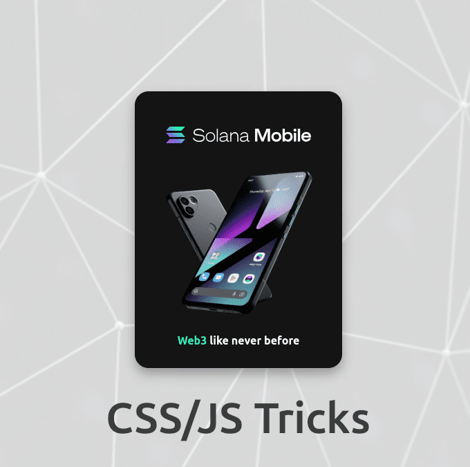
A 3D card is a visual element that creates the illusion of depth and rotation, giving users a sense of interaction with a three-dimensional object. This effect is achieved using CSS properties like transform, perspective, and transition.
Step-by-Step Code Explanation
Let’s break down the code used to create the 3D card.
HTML Structure:
<div class="card">
        <div class="card-inner">
            <div class="card-front">
                <div class="card-title">
                    <img src="dist/img/solana_mobile_logotype.svg" alt="Logo">
                </div>
                <img src="dist/img/saga.webp" alt="Image" class="card-image">
                <div class="hw-text">Web3 <span class="highlight">like never before</span></div>
            </div>
            <div class="card-back">
                <div class="card-title"><img src="dist/img/solana_mobile_logotype.svg" alt="Logo"></div>
                <div class="card-description">
                    <ul>
                        <li>
                            <h3><i class="fas fa-camera" style="margin-right: 10px;"></i>Incredible Cameras</h3>
                            <p>50MP main and 12MP ultrawide dual-camera system plus a 16MP selfie camera. Fire away!</p>
                        </li>
                        <li>
                            <h3><i class="fas fa-mobile-alt" style="margin-right: 10px;"></i>Stunning Display</h3>
                            <p>6.67″ FHD+ AMOLED screen with a peak refresh rate of 120Hz</p>
                        </li>
                        <li>
                            <h3><i class="fab fa-android" style="margin-right: 10px;"></i>Android 13</h3>
                            <p>A pure version of the mobile operating system you know and love, with full Google Play Services.</p>
                        </li>
                    </ul>
                </div>
                <a href="#" class="buy-button">Buy Now</a>
            </div>
        </div>
    </div>
Breakdown and Explanation
- Body Tag (
<body>):- The
<body>tag contains all the content of an HTML document, such as text, images, and other elements that make up the visible part of the webpage.
- The
- Card Container (
<div class="card">):- This
divelement acts as the container for the entire 3D card. Thecardclass defines the dimensions and perspective needed for the 3D effect.
- This
- Card Inner (
<div class="card-inner">):- This
divis a child of the card container. It holds the two sides of the card (front and back) and includes the transformation properties to enable the 3D flip effect when hovered.
- This
- Card Front (
<div class="card-front">):- This
divrepresents the front face of the card. It is styled to be the default visible side.
- This
- Card Title on Front (
<div class="card-title">):- Contains an image element (
<img>) displaying the logo. This title gives a branding touch to the front side of the card.
- Contains an image element (
- Card Image (
<img src="dist/img/saga.webp" alt="Image" class="card-image">):- An image displayed in the middle of the front side of the card. It adds visual interest and represents the product being showcased.
- Highlight Text (
<div class="hw-text">):- Contains a piece of text emphasizing a key message. The nested
spanwith the classhighlightis used to style part of this text differently, making it stand out.
- Contains a piece of text emphasizing a key message. The nested
- Card Back (
<div class="card-back">):- This
divrepresents the back face of the card, which becomes visible when the card is flipped.
- This
- Card Title on Back (
<div class="card-title">):- Similar to the front title, it contains an image element displaying the logo, maintaining consistency in branding on both sides of the card.
- Card Description (
<div class="card-description">):- Contains a
ulelement with multiplelielements, each presenting a feature of the product. This structured list allows easy readability and a detailed overview of the product features.
- Contains a
- Feature List Items (
<li>):- Each list item contains an
h3heading with an icon and a description (<p>). The icons are provided by Font Awesome, adding visual cues for each feature.
- Each list item contains an
- Call to Action Button (
<a href="#" class="buy-button">Buy Now</a>):- A button styled as a link that prompts users to take action, such as purchasing the product. It’s an important interactive element that drives conversions.
By understanding each part of the HTML structure, you can see how the 3D card is constructed and how different elements are organized to create a visually appealing and interactive component. This structure is versatile and can be used to highlight products, showcase features, or present important information in a compact, engaging format.
CSS Styling
Now, let’s examine the CSS which brings our 3D card to life.
Explanation:
- Body Styling:
body {
    display: flex;
    justify-content: center;
    align-items: center;
    height: 100vh;
    margin: 0;
    background: #fff url(img/bg.png) center / cover;
    font-family: 'Ubuntu', sans-serif;
}
The body is centered using Flexbox, and a background image if you need is set to cover the entire viewport.
But if you prefer simple background you can relace with this:
/* Replace this */
body {
    background: #fff url(img/bg.png) center / cover;
}

/* with this */
body {
    background: #000;
}
2. Card Container:
.card {
    width: 300px;
    height: 400px;
    perspective: 1000px;
}
The card class defines the size of the card and sets a perspective for the 3D effect.
3. Card Inner Styling:
.card-inner {
    width: 100%;
    height: 100%;
    transition: transform 0.5s;
    transform-style: preserve-3d;
    border-radius: 20px;
    background-color: rgba(20, 20, 20, 0.1);
    box-shadow: 0 8px 16px rgba(0, 0, 0, 0.3);
}

.card:hover .card-inner {
    transform: rotateY(180deg);
}
The card-inner class ensures smooth rotation and adds 3D styling. On hover, it rotates 180 degrees.
4. Card Faces:
.card-front,
.card-back {
    width: 100%;
    height: 100%;
    position: absolute;
    backface-visibility: hidden;
    border-radius: 20px;
}
Both card-front and card-back are positioned absolutely, hidden from the back, and styled with rounded corners.
5. Front Face Styling:
.card-front {
    display: flex;
    flex-direction: column;
    justify-content: center;
    align-items: center;
    background-color: rgb(20, 20, 20);
    backdrop-filter: blur(5px);
}
The front of the card is centered using Flexbox and has a blurred background for a sleek look.
6. Back Face Styling:
.card-back {
    display: flex;
    flex-direction: column;
    justify-content: center;
    align-items: center;
    background-color: rgb(20, 20, 20);
    backdrop-filter: blur(5px);
    transform: rotateY(180deg);
}
The back of the card is similar to the front but starts rotated by 180 degrees to enable the flip effect.
7. Common Styles:
.card-title {
    margin-top: 20px;
    font-size: 24px;
    color: #ffffff;
}

.card-image {
    width: 230px;
    height: 230px;
    margin: 20px 0;
}

.card-description {
    font-size: 14px;
    text-align: left;
    color: #ffffff;
    margin: 10px 0;
    padding-left: 10px;
    padding-right: 10px;
}

.card-description h3 {
    margin: 5px 0;
    display: flex;
    align-items: center;
    color: #ffffff;
}

.card-description p {
    margin: 5px 0;
}

.buy-button {
    padding: 10px 20px;
    background-color: #00ffb3;
    color: rgb(20, 20, 20);
    font-weight: bold;
    text-decoration: none;
    border: none;
    border-radius: 5px;
    cursor: pointer;
    transition: background-color 0.3s;
}

.buy-button:hover {
    background-color: #00ad79;
}

.highlight {
    color: #ffffff;
    font-size: 1rem;
}

.hw-text {
    color: #00ffb3;
    font-weight: bold;
    font-size: 1rem;
}

ul {
    list-style: none;
    padding-left: 10px;
}
Common styles are applied to elements inside the card, including text, images, and buttons for a cohesive design.
What is This 3D Card Good For in a Website?
- Enhanced User Engagement:
- Visual Appeal: The 3D card effect captures attention due to its dynamic nature. Users are more likely to interact with elements that stand out visually.
- Interactive Experience: By providing a flip animation on hover, users get a tactile sense of interaction, making the experience more engaging.
- Highlighting Key Information:
- Dual-Sided Information Display: The 3D card can display different information on each side. For instance, the front side can show an image or a key message, while the back side can provide detailed descriptions, features, or calls to action.
- Efficient Use of Space: By utilizing both sides of the card, you can present more information within a compact area, which is especially useful for mobile-responsive designs.
- Marketing and Promotions:
- Product Showcases: Use 3D cards to highlight new products or special promotions. The interactive element can draw attention and encourage users to explore more.
- Call to Action (CTA): The back of the card can include a CTA button (like “Buy Now” or “Learn More”), which becomes more prominent when users interact with the card.
- Portfolio Displays:
- Creative Portfolios: For designers, photographers, and artists, 3D cards can provide a unique way to display work samples. Each card can represent a project, with the front showing a thumbnail and the back providing details.
- Client Testimonials: Use 3D cards to present client testimonials. The front can feature a client’s photo and a short quote, while the back can include the full testimonial and client details.
- Educational Content:
- Interactive Learning: 3D cards can be used in educational websites to present quizzes or flashcards. The front of the card can pose a question or show a term, and the back can provide the answer or definition.
- Informative Sections: For websites providing detailed information (like encyclopedias or tutorials), 3D cards can help in breaking down content into manageable, interactive pieces.
This 3D card uses modern web technologies like Flexbox, CSS transitions, and 3D transforms to create an engaging user experience. By understanding each part of the code, you can customize and extend this example to fit your projects. Happy coding!
Recommended Resource:
- Check out MDN Web Docs on CSS Transforms for more details on creating stunning effects.
