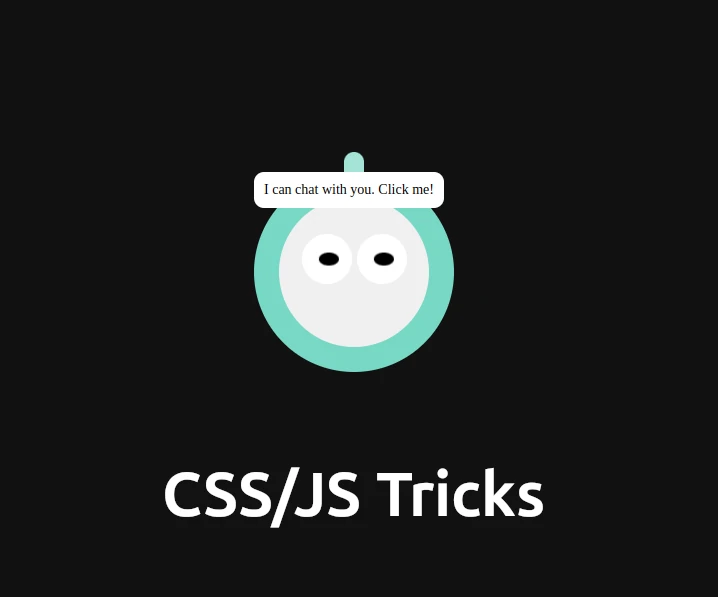
Imagine visiting a website and being greeted by a friendly, animated robot head that invites you to chat. It’s not just functional but also adds a whimsical touch to your site. In this blog post, we’ll walk you through the process of creating such an engaging support chat UI with HTML, CSS, and JavaScript. We’ll break down the code line by line, making it easy for you to follow along and implement it on your site.
Table of Contents
Introduction
Our goal is to create a fun, animated robot head that bounces and blinks, and a hidden support chat window that appears when the robot is clicked. This interactive feature will make your website’s support system more engaging and user-friendly.
HTML Structure
The HTML structure sets up the layout of our animated robot and support chat UI. Let’s dive into the code:
<!DOCTYPE html>
<html lang="en">
<head>
    <meta charset="UTF-8">
    <meta name="viewport" content="width=device-width, initial-scale=1.0">
    <title>Animated - emoji</title>
    <link rel="stylesheet" href="https://cdnjs.cloudflare.com/ajax/libs/font-awesome/6.0.0-beta3/css/all.min.css">
    <style>
        /* CSS Code */
    </style>
</head>
<body>
    <div class="container">
        <div class="dark-theme">
            <div class="alien" onclick="toggleSupportChat()">
                <div class="antenna"></div>
                <div class="head">
                    <div class="eye left-eye">
                        <div class="eye-inner"></div>
                    </div>
                    <div class="eye right-eye">
                        <div class="eye-inner"></div>
                    </div>
                </div>
                <div class="speech-bubble">I can chat with you. Click me!</div>
            </div>
        </div>
        <div class="support-chat" id="supportChat">
            <div class="chat-header">
                <span class="chat-title">Support Chat</span>
                <button class="close-btn" onclick="closeSupportChat()"><i class="fas fa-times"></i></button>
            </div>
            <div class="chat-body">
                <div class="chat-box">
                    <div class="support-chat-lines"><span class="chat-id">Support:</span> Hello, how can I help you?</div>
                </div>
            </div>
            <div class="chat-footer">
                <input type="text" placeholder="Type your message">
                <button>Send</button>
            </div>
        </div>
    </div>
    <script>
        /* JavaScript Code */
    </script>
</body>
</html>
Breaking Down the HTML
DOCTYPE Declaration:
<!DOCTYPE html>
Declares the document type as HTML5, ensuring the browser correctly interprets the code.
HTML Element:
<html lang="en">
Starts the HTML document and sets the language to English.
Head Section:
<head>
    <meta charset="UTF-8">
    <meta name="viewport" content="width=device-width, initial-scale=1.0">
    <title>Animated - emoji</title>
    <link rel="stylesheet" href="https://cdnjs.cloudflare.com/ajax/libs/font-awesome/6.0.0-beta3/css/all.min.css">
    <style>
        /* CSS Code */
    </style>
</head>
Links to Font Awesome for using icons.
<link rel="stylesheet" href="https://cdnjs.cloudflare.com/ajax/libs/font-awesome/6.0.0-beta3/css/all.min.css">
Container:
<div class="container">
Creates a flex container to center the content both vertically and horizontally.
Dark Theme Wrapper:
<div class="dark-theme">
Applies a dark background color to the inner content.
Alien Robot Head:
<div class="alien" onclick="toggleSupportChat()">
Represents the robot head and includes an onclick event to toggle the chat window.
Antenna:
<div class="antenna"></div>
Creates the robot’s antenna.
Head and Eyes:
<div class="head">
    <div class="eye left-eye">
        <div class="eye-inner"></div>
    </div>
    <div class="eye right-eye">
        <div class="eye-inner"></div>
    </div>
</div>
Constructs the robot’s head and eyes, including inner eye elements for blinking animation.
Speech Bubble:
<div class="speech-bubble">I can chat with you. Click me!</div>
Adds a speech bubble that appears on hover, inviting users to click and chat.
Support Chat Window:
<div class="support-chat" id="supportChat">
Defines the hidden support chat window that appears when the robot is clicked.
Chat Header:
<div class="chat-header">
    <span class="chat-title">Support Chat</span>
    <button class="close-btn" onclick="closeSupportChat()"><i class="fas fa-times"></i></button>
</div>
Adds a header with a title and close button for the chat window.
Chat Body:
<div class="chat-body">
    <div class="chat-box">
        <div class="support-chat-lines"><span class="chat-id">Support:</span> Hello, how can I help you?</div>
    </div>
</div>
Contains the chat messages, with an initial support message.
Chat Footer:
<div class="chat-footer">
    <input type="text" placeholder="Type your message">
    <button>Send</button>
</div>
Provides an input field and send button for users to type and send messages.
CSS Styling
Next, we style our robot head and chat window to bring them to life. Here’s the CSS code with detailed explanations:
body {
    margin: 0;
    padding: 0;
    background-color: #111;
}
Sets the body to have no margin or padding and a dark background color.
.container {
    display: flex;
    justify-content: center;
    align-items: center;
    height: 100vh;
}
Centers the content both vertically and horizontally within the viewport.
.dark-theme {
    background-color: #111;
}
Applies a dark background color to the .dark-theme wrapper.
.alien {
    width: 200px;
    height: 200px;
    background-color: #76d7c4;
    border-radius: 50%;
    position: relative;
    animation: jump 1s infinite alternate;
    cursor: pointer;
}
Styles the robot head:
- Width and Height: Sets the size to 200×200 pixels.
- Background Color: Uses a teal color for the head.
- Border Radius: Makes the head circular.
- Position: Uses relative positioning for the animation.
- Animation: Applies a jumping animation.
- Cursor: Changes the cursor to a pointer on hover.
.antenna {
    width: 20px;
    height: 60px;
    background-color: #a3e4d7;
    position: absolute;
    top: -20px;
    left: 50%;
    transform: translateX(-50%);
    border-radius: 10px 10px 0 0;
}
tyles the antenna:
- Width and Height: Sets the size to 20×60 pixels.
- Background Color: Uses a lighter teal color.
- Position: Places the antenna above the head, centered horizontally.
- Border Radius: Rounds the top edges.
.head {
    width: 150px;
    height: 150px;
    background-color: #f0f0f0;
    border-radius: 50%;
    position: absolute;
    top: 50%;
    left: 50%;
    transform: translate(-50%, -50%);
}
Styles the inner head:
- Width and Height: Sets the size to 150×150 pixels.
- Background Color: Uses a light gray color.
- Border Radius: Makes it circular.
- Position: Centers the head within the
.aliencontainer.
.eye {
    width: 50px;
    height: 50px;
    background-color: #fff;
    border-radius: 50%;
    position: absolute;
    top: 25%;
}
tyles the eyes:
- Width and Height: Sets the size to 50×50 pixels.
- Background Color: Uses white.
- Border Radius: Makes them circular.
- Position: Positions them at the top quarter of the head.
.left-eye {
    left: 15%;
}
Positions the left eye 15% from the left side.
.right-eye {
    right: 15%;
}
Positions the right eye 15% from the right side.
.eye-inner {
    width: 20px;
    height: 20px;
    background-color: #000;
    border-radius: 50%;
    position: absolute;
    top: 50%;
    left: 50%;
    transform: translate(-50%, -50%);
    animation: blink 5s infinite alternate, move-eyes 3s infinite alternate;
}
Styles the inner part of the eyes:
- Width and Height: Sets the size to 20×20 pixels.
- Background Color: Uses black.
- Border Radius: Makes them circular.
- Position: Centers them within the eyes.
- Animation: Applies blinking and moving animations.
.speech-bubble {
    position: absolute;
    background-color: #fff;
    border-radius: 10px;
    padding: 10px;
    font-size: 14px;
}
tyles the speech bubble:
- Position: Uses absolute positioning.
- Background Color: Uses white.
- Border Radius: Rounds the edges.
- Padding: Adds padding for spacing.
- Font Size: Sets the font size to 14px.
.alien:hover .speech-bubble {
    display: block;
    top: -50px;
    left: 60px;
}
Displays the speech bubble when the robot head is hovered.
.support-chat {
    position: fixed;
    top: 50%;
    left: 50%;
    transform: translate(-50%, -50%);
    width: 300px;
    background-color: #fff;
    border: 1px solid #ccc;
    border-radius: 10px;
    box-shadow: 0 0 10px rgba(0, 0, 0, 0.1);
    display: none;
}
Styles the support chat window:
- Position: Fixes it in the center of the viewport.
- Size: Sets the width to 300px.
- Background Color: Uses white.
- Border: Adds a light gray border.
- Border Radius: Rounds the edges.
- Box Shadow: Adds a shadow for depth.
- Display: Initially hides the chat window.
.chat-header {
    background-color: #76d7c4;
    color: #fff;
    padding: 10px;
    border-top-left-radius: 10px;
    border-top-right-radius: 10px;
    display: flex;
    justify-content: space-between;
}
Styles the chat header:
- Background Color: Uses teal.
- Text Color: Uses white.
- Padding: Adds padding for spacing.
- Border Radius: Rounds the top corners.
- Display: Uses flexbox for layout.
- Justify Content: Spreads content evenly.
.close-btn {
    background: none;
    border: none;
    color: #fff;
    font-size: 18px;
}
Styles the close button:
- Background and Border: Removes background and border.
- Color: Uses white for the icon.
- Font Size: Sets the font size to 18px.
.chat-body {
    padding: 10px;
}
Adds padding to the chat body for spacing.
.chat-box {
    max-height: 200px;
    overflow-y: auto;
}
Styles the chat box:
- Max Height: Limits the height to 200px.
- Overflow Y: Adds vertical scrolling if needed.
.chat-footer {
    display: flex;
    padding: 10px;
}
Styles the chat footer:
- Display: Uses flexbox for layout.
- Padding: Adds padding for spacing.
.chat-footer input {
    flex: 1;
    padding: 5px;
    border: 1px solid #ccc;
    border-radius: 5px;
}
Styles the input field:
- Flex: Makes it take up available space.
- Padding: Adds padding for comfort.
- Border: Adds a light gray border.
- Border Radius: Rounds the edges.
.chat-footer button {
    padding: 5px 10px;
    background-color: #76d7c4;
    color: #fff;
    border: none;
    border-radius: 5px;
    margin-left: 5px;
}
- Styles the send button:
- Padding: Adds padding for comfort.
- Background Color: Uses teal.
- Text Color: Uses white.
- Border: Removes border.
- Border Radius: Rounds the edges.
- Margin Left: Adds margin to the left for spacing.
JavaScript Interactivity
Now, let’s add some interactivity with JavaScript. This code will make the chat window appear and disappear when the robot head is clicked.
<script>
    function toggleSupportChat() {
        var chat = document.getElementById('supportChat');
        if (chat.style.display === 'block') {
            chat.style.display = 'none';
        } else {
            chat.style.display = 'block';
        }
    }

    function closeSupportChat() {
        var chat = document.getElementById('supportChat');
        chat.style.display = 'none';
    }
</script>
Breaking Down the JavaScript
Toggle Support Chat Function:
function toggleSupportChat() {
Defines a function to toggle the display of the support chat.
Get Chat Element:
var chat = document.getElementById('supportChat');
Retrieves the chat window element by its ID.
Toggle Display:
if (chat.style.display === 'block') {
    chat.style.display = 'none';
} else {
    chat.style.display = 'block';
}
Checks the current display style and toggles it between block and none.
Close Support Chat Function:
function closeSupportChat() {
Defines a function to close the support chat.
Set Display to None:
var chat = document.getElementById('supportChat');
chat.style.display = 'none';
- Hides the chat window by setting its display to
none.
Conclusion
By following this guide, you’ve created a fun and engaging support chat UI with an animated cartoony robot head. This interactive feature not only enhances the user experience but also adds a playful element to your website. Feel free to customize the styles and functionality to fit your brand and needs.
Happy coding!
External Links
- Font Awesome Icons: Add beautiful icons to your project.
- CSS Animations Guide: Learn more about creating animations with CSS.
- JavaScript Basics: A beginner’s guide to understanding JavaScript.
