Ever wondered what it would be like to have the power to control the Earth and Sun? Well, I did too, and instead of becoming a celestial deity, I decided to write some code. So, before you embark on this cosmic adventure, let’s start with a quick HTML and CSS tutorial. Don’t worry; it’s simpler than navigating the galaxy.
Table of Contents
Step 1: Setting Up Your Cosmic Canvas
First things first, you need a canvas for your celestial artwork. We’re talking HTML here, folks. Create a basic HTML document with the essential boilerplate. Don’t worry; it’s as easy as pie—cosmic pie.
<!DOCTYPE html>
<html lang="en">
<head>
  <meta charset="UTF-8">
  <meta name="viewport" content="width=device-width, initial-scale=1.0">
  <title>Earth and Sun</title>
  <style>
    /* Your CSS will go here */
  </style>
</head>
<body>
  <!-- Your HTML content will go here -->
</body>
</html>
Step 2: Styling the Universe
Next, we’ll use some CSS to set the mood. Think dark and starry night. We’re going to style the body, the Earth, the Sun, and some twinkling stars.
body {
  background-color: #000;
  color: #fff;
  font-family: Arial, sans-serif;
  margin: 0;
  padding: 0;
  overflow: hidden;
}
Step 3: Making the Earth
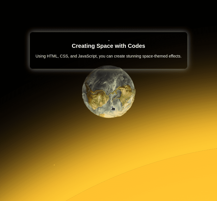
The Earth needs to be perfectly spherical (well, as spherical as a CSS border-radius can get). We’ll also set up a rotation animation for when you hover over it.
.earth {
  position: absolute;
  top: 45%;
  left: 50%;
  width: 200px;
  height: 200px;
  background: url('https://www.meacodes.com/wp-content/uploads/2024/06/earth.png') no-repeat center center;
  background-size: cover;
  border-radius: 50%;
  transform: translate(-50%, -50%);
  transition: transform 2s ease-in-out;
  cursor: pointer;
}

.earth:hover {
  animation: rotateEarth 4s linear infinite;
}

@keyframes rotateEarth {
  0% {
    transform: translate(-50%, -50%) rotate(0deg);
  }
  100% {
    transform: translate(-50%, -50%) rotate(360deg);
  }
}
Step 4: Here Comes the Sun
Now for the Sun! It’s big, it’s bright, and it’s going to make a dramatic entrance from the right side of the screen. We’ll use a gradient to give it that glowing look.
.sun {
  position: absolute;
  top: 70%;
  right: -2670px;
  width: 3000px;
  height: 3000px;
  background: radial-gradient(circle at center, #ffdb00 30%, #ffdb00 40%, #ffaa00 100%);
  border-radius: 50%;
  box-shadow: 0 0 200px 100px #ffdb00, 0 0 100px 50px #ff8000, 0 0 300px 150px #ffae00;
  transition: right 10s ease;
  opacity: 0;
  z-index: 999;
}
Step 5: Add Some Stars
What’s space without stars? Randomly position some tiny white dots that fade in and out. This will give our scene a bit more depth and sparkle.
.star {
  position: absolute;
  width: 3px;
  height: 3px;
  background-color: #fff;
  border-radius: 50%;
  opacity: 0;
  animation: fadeInOut 5s linear infinite;
}

@keyframes fadeInOut {
  0%, 100% {
    opacity: 0;
  }
  50% {
    opacity: 1;
  }
}
Step 6: The Cosmic Interaction
Time to bring in the JavaScript to handle our interactions. We want the Sun to appear when we hover over the Earth and disappear when we move the mouse away.
const earth = document.querySelector('.earth');
const sun = document.querySelector('.sun');

earth.addEventListener('mouseenter', () => {
  sun.style.right = '-1500px';
  sun.style.opacity = '0';
  sun.style.transition = 'right 10s ease';
  sun.style.transitionDelay = '0s';
  sun.style.opacity = '1';
  sun.style.right = '50%';
});

earth.addEventListener('mouseleave', () => {
  sun.style.transitionDelay = '2s';
  sun.style.right = '-1500px';
});
Step 7: Sit Back and Enjoy Your Universe
Voilà! You’ve just created your very own interactive space simulation. Now sit back, relax, and enjoy watching the Earth spin and the Sun zoom across the screen. Who knew cosmic power could be this easy?
And there you have it, folks! With just a few lines of code, you’ve managed to recreate the majestic dance of the Earth and Sun. Whether you’re a beginner or a seasoned pro, sometimes it’s fun to play God—just for a little while.
Ready to dive deeper into HTML and CSS? Check out these resources:
- W3Schools HTML Tutorial – A comprehensive tutorial for learning HTML from scratch.
- MDN Web Docs: CSS – Explore CSS concepts, properties, and examples on Mozilla Developer Network.
Now that you’ve got the basics down, let’s dive into creating your very own space simulation! With just a few lines of code and a sprinkle of cosmic creativity, you’ll soon be controlling planets and stars like a pro.
Final Thoughts
Remember, coding is not just about solving problems but also about having fun and getting creative. So go ahead, tweak the animations, add some more stars, or maybe even throw in a moon! The universe is your playground. 🌍☀️✨
