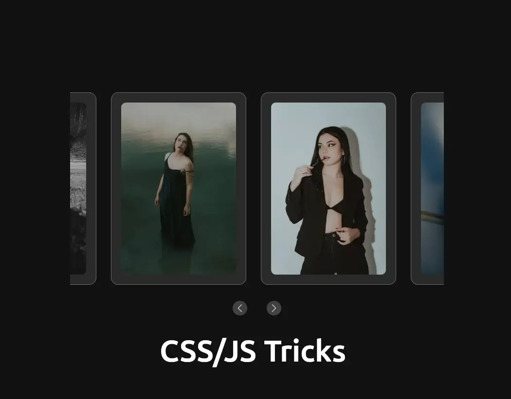
In this tutorial, we’ll walk through how to create a captivating image gallery for your website using simple HTML, CSS styling, and JavaScript magic. This gallery not only showcases your images beautifully but also allows users to interact with them in a seamless way.
Table of Contents
Understanding the Basics: HTML Structure
Let’s start with the foundation of our gallery—HTML. This language gives structure to our content on the web. Here’s a simplified breakdown of what each part does:
<!DOCTYPE html>: This is like a passport that tells the browser, “Hey, I’m using HTML5!”<html lang="en">: Defines the language of our webpage (in this case, English).<head>: This is where we put important info about our page, like its title and links to stylesheets.<meta charset="UTF-8">and<meta name="viewport" content="width=device-width, initial-scale=1.0">: These make sure our text and layout look good on all devices.<title>: Sets the title of our webpage, which appears in the browser tab.
Introducing Swiper for Interactive Image Galleries
To create a captivating interactive image gallery on your website, we’ll be utilizing the Swiper library. Swiper is a powerful and flexible JavaScript library that allows seamless integration of touch-friendly sliders and carousels. It’s perfect for showcasing images in an engaging manner across different devices.
Getting Started with Swiper
To integrate Swiper into your project, follow these steps:
- Include Swiper Library:Add the following line of code inside the
<head>section of your HTML file to link to the Swiper CSS file hosted on the unpkg CDN:
<link rel="stylesheet" href="https://unpkg.com/swiper/swiper-bundle.min.css">
This line provides the necessary styles to implement an interactive image gallery effortlessly.
Add Swiper JavaScript:
Place the following line of code at the end of the <body> section of your HTML file, just before the closing </body> tag:
<script src="https://unpkg.com/swiper/swiper-bundle.min.js"></script>
- Adding the Swiper JavaScript at the end of the body ensures that the HTML content is loaded before the scripts, improving page load performance.
- Implementing Swiper:Once you’ve included the Swiper library, proceed with setting up the Swiper slider and integrating it with your HTML structure, as explained in the rest of this tutorial.
By following these steps, you’ll enhance your website with a dynamic image gallery powered by Swiper, offering an intuitive user experience across various devices.
Now, onto the exciting part—the content itself!
<!-- Container for the image gallery -->
<div class="swiper-container">
    <!-- Wrapper for slides -->
    <div class="swiper-wrapper">
        <!-- Individual slide with image -->
        <div class="swiper-slide card" data-image="https://www.meacodes.com/wp-content/uploads/2024/06/4-1.webp">
            <img src="https://www.meacodes.com/wp-content/uploads/2024/06/4-1.webp" alt="Card 1">
        </div>
        <!-- Repeat for other images -->
    </div>
</div>

<!-- Modal for displaying larger image -->
<div id="modal" class="modal">
    <div class="modal-content">
        <img id="modalImg" class="modal-img" src="" alt="Popup Image">
    </div>
</div>

<!-- Navigation buttons for the slider -->
<div class="swiper-navigation">
    <div class="swiper-button-next"></div>
    <div class="swiper-button-prev"></div>
</div>
Adding Style: Making It Look Good with CSS
Now, let’s sprinkle some CSS to make our gallery visually appealing and user-friendly. Imagine this as dressing up our HTML elements to look their best:
body {
    background-color: #121212;
    color: #ffffff;
    font-family: Arial, sans-serif;
    display: flex;
    justify-content: center;
    align-items: center;
    height: 100vh;
    margin: 0;
}
body: Selects the entire body of the HTML document.
background-color: #121212;: Sets the background color to a dark gray (#121212).color: #ffffff;: Sets the text color to white (#ffffff).font-family: Arial, sans-serif;: Specifies the font family for text, using Arial or any sans-serif font if Arial isn’t available.display: flex;: Uses Flexbox to align child elements.justify-content: center;: Centers content horizontally within the body.align-items: center;: Centers content vertically within the body.height: 100vh;: Sets the height of the body to 100% of the viewport height, ensuring the content fills the screen.margin: 0;: Removes default margin to ensure content starts from the edge of the body.
.swiper-container {
    width: 40%;
    max-width: 1200px;
    padding: 20px 0;
    overflow: hidden;
    margin-top: 50px;
}
.swiper-container: Targets the container for the Swiper slider.
width: 40%;: Sets the width of the container to 40% of its parent element.max-width: 1200px;: Limits the maximum width to 1200 pixels to ensure it’s not too wide on larger screens.padding: 20px 0;: Adds padding above and below the container.overflow: hidden;: Ensures any content that overflows the container is hidden.margin-top: 50px;: Adds space above the container to create distance from the top.
.swiper-slide {
    position: relative;
    background: rgba(255, 255, 255, 0.1);
    border-radius: 15px;
    padding: 20px;
    box-shadow: 0 4px 30px rgba(0, 0, 0, 0.1);
    backdrop-filter: blur(10px);
    -webkit-backdrop-filter: blur(10px);
    border: 1px solid rgba(255, 255, 255, 0.3);
    display: flex;
    justify-content: center;
    align-items: center;
    font-size: 1.5rem;
    overflow: hidden;
    cursor: pointer;
}
.swiper-slide: Styles each slide within the Swiper slider.
position: relative;: Establishes a positioning context for child elements.background: rgba(255, 255, 255, 0.1);: Sets a semi-transparent white background for the slide.border-radius: 15px;: Rounds the corners of the slide.padding: 20px;: Adds internal spacing within each slide.box-shadow: 0 4px 30px rgba(0, 0, 0, 0.1);: Applies a subtle shadow effect for depth.backdrop-filter: blur(10px);and-webkit-backdrop-filter: blur(10px);: Adds a blurred effect behind the slide content.border: 1px solid rgba(255, 255, 255, 0.3);: Adds a light border around the slide.display: flex;: Utilizes Flexbox for layout control.justify-content: center;: Centers content horizontally.align-items: center;: Centers content vertically.font-size: 1.5rem;: Sets the font size to 1.5 times the default size.overflow: hidden;: Hides any content that overflows the slide.cursor: pointer;: Changes the cursor to a pointer when hovering over the slide, indicating interactivity.
.swiper-slide img {
    width: 100%;
    height: 100%;
    object-fit: cover;
    border-radius: 10px;
    opacity: 0.8;
    transition: opacity 0.3s ease;
}
.swiper-slide img: Targets the images within each slide.
- **
width: 100%;andheight: 100%;: Ensures the image fills its container while maintaining aspect ratio. object-fit: cover;: Scales the image to cover its entire container, cropping as needed.border-radius: 10px;: Rounds the corners of the image.opacity: 0.8;: Sets the initial opacity of the image to 80%.transition: opacity 0.3s ease;: Smoothly transitions the opacity over 0.3 seconds with an ease effect on hover.
.modal {
    display: none;
    position: fixed;
    z-index: 999;
    top: 0;
    left: 0;
    width: 100%;
    height: 100%;
    background-color: rgba(0, 0, 0, 0.8);
    justify-content: center;
    align-items: center;
}

.modal.active {
    display: flex;
}

.modal-content {
    display: flex;
    justify-content: center;
    max-width: 80%;
    max-height: 80%;
}

.modal-img {
    width: 60%;
    height: 100%;
    object-fit: contain;
    border-radius: 10px;
}
.modal: Styles the modal container for displaying larger images.
display: none;: Initially hides the modal.position: fixed;: Fixes the modal’s position relative to the viewport.z-index: 999;: Ensures the modal appears above other content (high z-index).top: 0; left: 0; width: 100%; height: 100%;: Covers the entire viewport with the modal.background-color: rgba(0, 0, 0, 0.8);: Sets a semi-transparent black background for the modal.justify-content: center; align-items: center;: Centers content horizontally and vertically within the modal.
.modal.active: Activates the modal to display it.
display: flex;: Shows the modal content when active.
.modal-content: Styles the content area within the modal.
max-width: 80%; max-height: 80%;: Limits the maximum width and height of the modal content to 80% of the viewport.display: flex; justify-content: center;: Centers the content horizontally within the modal.
.modal-img: Styles the image within the modal.
width: 60%; height: 100%;: Sets the image width to 60% of its container while maintaining its aspect ratio.object-fit: contain;: Scales the image to fit within its container without cropping, maintaining aspect ratio.border-radius: 10px;: Rounds the corners of the image.
Bringing It to Life: JavaScript Magic
Now, let’s add some JavaScript to make our gallery interactive. JavaScript is like the conductor of an orchestra—it makes everything work together harmoniously:
const swiper = new Swiper('.swiper-container', {
    slidesPerView: 3,
    spaceBetween: 30,
    centeredSlides: true,
    loop: true,
    navigation: {
        nextEl: '.swiper-button-next',
        prevEl: '.swiper-button-prev',
    },
    breakpoints: {
        640: {
            slidesPerView: 1,
            spaceBetween: 20,
            centeredSlides: false,
        },
        768: {
            slidesPerView: 2,
            spaceBetween: 30,
            centeredSlides: false,
        },
        1024: {
            slidesPerView: 3,
            spaceBetween: 30,
            centeredSlides: true,
        },
    },
});
const swiper = new Swiper('.swiper-container', { ... });: Initializes a new Swiper instance on an element with the class swiper-container.
slidesPerView: 3,: Configures the number of slides visible in the viewport at a time.spaceBetween: 30,: Specifies the space between slides in pixels.centeredSlides: true,: Centers the active slide in the viewport.loop: true,: Enables infinite loop mode.navigation: { nextEl: '.swiper-button-next', prevEl: '.swiper-button-prev' },: Adds navigation buttons for next and previous slides.breakpoints: { ... }: Defines responsive breakpoints for different screen sizes, adjustingslidesPerView,spaceBetween, andcenteredSlidesaccordingly.
document.querySelectorAll('.swiper-slide').forEach(item => {
    item.addEventListener('click', function() {
        const imageUrl = this.getAttribute('data-image');
        document.getElementById('modalImg').src = imageUrl;
        document.getElementById('modal').classList.add('active');
    });
});
document.querySelectorAll('.swiper-slide').forEach(item => { ... });: Selects all elements with the class swiper-slide and adds a click event listener to each.
item.addEventListener('click', function() { ... });: Listens for a click on each slide.const imageUrl = this.getAttribute('data-image');: Retrieves thedata-imageattribute value (URL of the image) from the clicked slide.document.getElementById('modalImg').src = imageUrl;: Sets the source (src) of the image in the modal to the clicked image URL.document.getElementById('modal').classList.add('active');: Activates the modal by adding theactiveclass to display it.
document.getElementById('modal').addEventListener('click', function(event) {
    if (event.target === this) {
        this.classList.remove('active');
    }
});
document.getElementById('modal').addEventListener('click', function(event) { ... });: Adds a click event listener to the modal element.
if (event.target === this) { this.classList.remove('active'); }: Checks if the click occurred on the modal itself (not its children).this.classList.remove('active');: Deactivates the modal by removing theactiveclass when clicking outside the modal image.
Wrapping It Up
Voilà! You’ve just created a stunning image gallery sweeper using HTML, CSS, and JavaScript. Now your website visitors can enjoy scrolling through your images, clicking to view larger versions in a modal, and navigating easily with intuitive navigation buttons.
Feel free to customize the styles and functionality further to match your website’s unique look and feel. Enjoy showcasing your images with style!
Further Resources
- Swiper Documentation
Swiper is a powerful library for creating responsive touch sliders. Refer to their documentation for advanced customization options and features. - CSS Tricks – A Complete Guide to Flexbox
Flexbox is essential for layout design in CSS. This guide from CSS Tricks provides comprehensive explanations and examples. - MDN Web Docs – HTML
MDN Web Docs offer detailed explanations and examples for all HTML elements and attributes, helping you understand how to structure your web pages effectively. - W3Schools – JavaScript Tutorial
W3Schools provides a beginner-friendly tutorial on JavaScript, covering everything from basic syntax to more advanced concepts, essential for adding interactivity to your website.
Dive Deeper
Explore these resources to expand your knowledge and skills in building engaging and interactive web experiences with HTML, CSS, and JavaScript.
