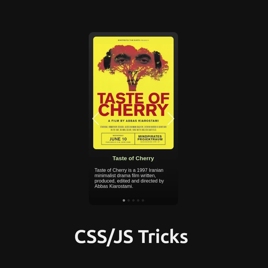
Are you ready to elevate your web development skills to new heights? Prepare to embark on an exciting journey as we delve deep into the art of creating a stunning CSS Slider. Whether you’re a seasoned developer looking to expand your toolkit or a curious student eager to learn, this comprehensive guide will equip you with the knowledge and skills to build captivating interfaces that dazzle and delight.
Table of Contents
Understanding the CSS Slider Element
Let’s start by unraveling the essence of a CSS Slider. At its core, a CSS Slider is a dynamic web component that allows you to showcase multiple images or content items within a single interface. With seamless transitions and interactive controls, it enhances user experience and adds a touch of elegance to your web projects.
Deconstructing the HTML Structure
To build our CSS Slider, we’ll begin by laying down the foundation with HTML:
<!DOCTYPE html>
<html lang="en">
<head>
    <meta charset="UTF-8">
    <meta name="viewport" content="width=device-width, initial-scale=1.0">
    <title>Glassy Dark Mode Card</title>
    <!-- Link to Swiper CSS -->
</head>
<body>
    <div class="card-container">
        <div class="card">
            <div class="swiper-container">
                <div class="swiper-wrapper">
                    <!-- Individual slides -->
                </div>
                <!-- Pagination and navigation buttons -->
            </div>
        </div>
    </div>
    <!-- Script tags for Swiper JS -->
</body>
</html>
In this HTML structure:
- We’ve included the necessary meta tags for character set and viewport.
- The Swiper CSS and JavaScript files are linked for seamless integration.
- The
.card-container,.card, and.swiper-containerdivs serve as containers for our Slider.
Crafting the CSS Styles
Next, let’s breathe life into our Slider with CSS styling:
/* Global styles */
body {
    display: flex;
    justify-content: center;
    align-items: center;
    height: 100vh;
    background-color: #121212;
    margin: 0;
    font-family: 'Arial', sans-serif;
}

/* Card container styling */
.card-container {
    display: flex;
    justify-content: center;
    align-items: center;
}

/* Card styling */
.card {
    width: 300px;
    background: linear-gradient(180deg, #292929 0%, #0A0A0A 100%);
    /* Additional card styles */
}

/* Swiper container styling */
.swiper-container {
    width: 100%;
    height: 100%;
    /* Additional swiper container styles */
}

/* Swiper slide styling */
.swiper-slide {
    display: flex;
    flex-direction: column;
    align-items: center;
    /* Additional swiper slide styles */
}

/* Additional styling for slide elements */
/* Customize as needed */
Here, we’ve applied styles to various elements:
- Body: Centered layout with a dark background.
- Card container: Centered alignment for the slider.
- Card: Styling for the slider container.
- Swiper container and slide: Styling for the Swiper elements.
Infusing Interactivity with JavaScript
Finally, let’s add dynamic functionality to our Slider using JavaScript:
document.addEventListener('DOMContentLoaded', function() {
    var swiper = new Swiper('.swiper-container', {
        loop: true,
        pagination: {
            el: '.swiper-pagination',
            clickable: true,
        },
        navigation: {
            nextEl: '.swiper-button-next',
            prevEl: '.swiper-button-prev',
        },
    });
});
In this JavaScript snippet:
- We’ve initialized a new Swiper instance, enabling looped slides, pagination, and navigation controls.
- The Swiper instance is bound to the
.swiper-containerelement.
Conclusion: Your Journey to CSS Mastery Begins Here
Congratulations! You’ve unlocked the secrets to crafting a dynamic CSS Slider from scratch. Armed with this newfound knowledge, you’re ready to embark on your web development odyssey with confidence.
So, what are you waiting for? Dive in, experiment, and let your creativity soar as you continue to master the art of web development!


